Week Five/Week Six
Choose one idea to work on for two weeks
Brainstorm/subject matter of previous idea (playground) with Oli and Meg's input on development/alternative ideas
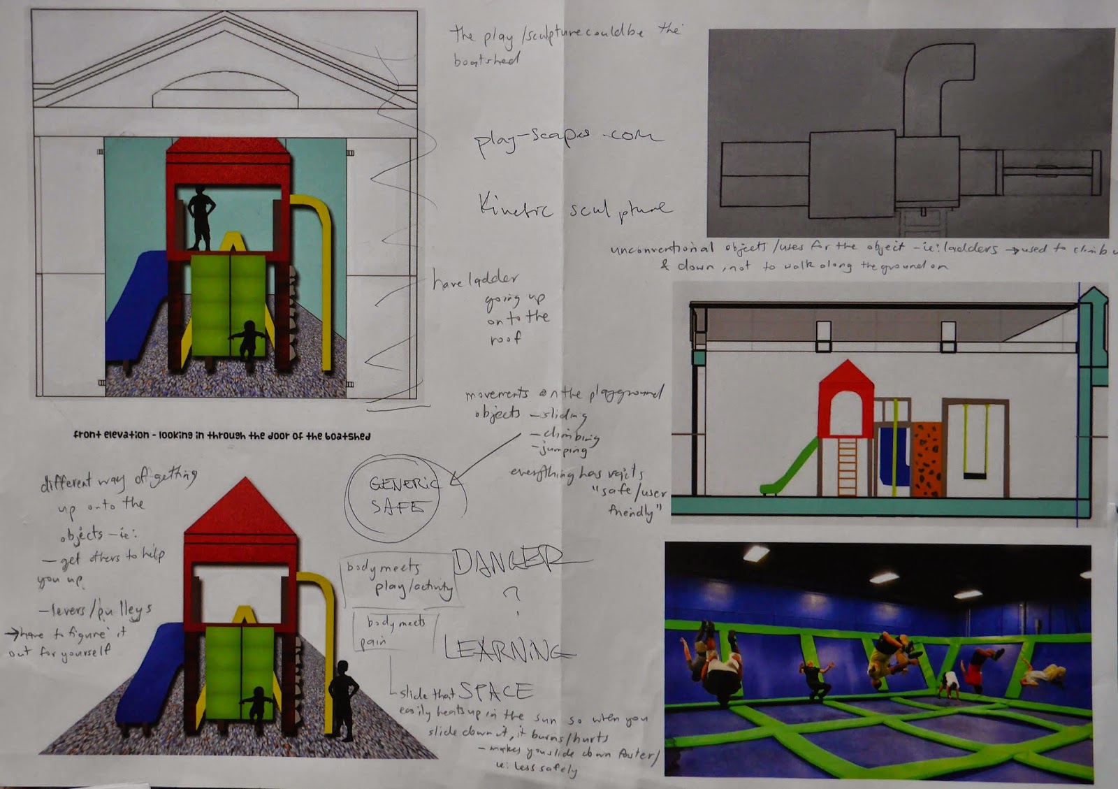
initial mind map/brainstorm of ideas for alternative meetings
subject matter relating to sculpture/kinetic sculpture/un-generic play areas
(ie:without set structures like slides where you can only slide a certain direction...etc)
Brainstorm/subject matter of previous idea (playground) with Oli and Meg's input on development/alternative ideas

initial mind map/brainstorm of ideas for alternative meetings
(ie:without set structures like slides where you can only slide a certain direction...etc)
My 5 alternate responses to my previous meeting space, which was a playground
My alternate response is a meeting between change and adaptation
This is in the context of being in a play area so the changes can all occur in the setting of being at a playground.
Timber has been combined into a very abstract playground structure.
this play area could be used at night time as well because of the lighting incorporated into the design
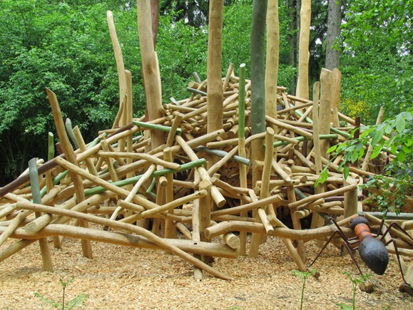
Danish artist Hans Henrick Ohlers - organic playground sculptures
He includes features which allow for night-time play.
Design possibilities of ordinary materials
…the construction of cable spools and climbing nets was an urban intervention for the Virada Cultural organized by the city council of São Paulo. Sometimes playgrounds made of found and recycled components look a mess. Adding a repetitive motif, like Basurama did with their triangles, pulls it all together into a cohesive whole.
…the construction of cable spools and climbing nets was an urban intervention for the Virada Cultural organized by the city council of São Paulo. Sometimes playgrounds made of found and recycled components look a mess. Adding a repetitive motif, like Basurama did with their triangles, pulls it all together into a cohesive whole.
Kids ........ usually like being up high...the thrill of being up above everyone else.
I could incorporate a ladder going up onto the roof of the boat shed in my design and I could even have a slide going down from the roof (see image below)
San Francisco’s Emporium department store.
-Featured an assortment of rooftop entertainments/rooftop slide
above and below : sculptural structures that qualify as play areas because of their shape and ability to be climbed/sat/jumped on etc...
When you think about the image above, how do you really play on this structure?
Kids would've been scolded, dripping wet, muddy, and maybe even crying because they couldn’t take the heat of the metal (warmed up by the sun) and would ultimately end up sliding off into the moat below. This seems like a structure where it is less fun and ultimately more of a hassle to play on
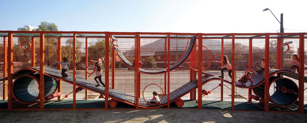
instead of having a play area just inside the boat shed I could have the play area merging/as part of the boat shed's walls/roof etc...
ie: having ladders at the 'walls' of the shed which allow you to climb up onto the roof
The structure above has the normal user friendly rails that you see on a playground.
Thinking back to when I was a kid I remember always climbing on top of things, rather than through them as I found it more fun and exciting. Kids like to test/try things out for themselves. Its all part of the experience of learning and adapting
looking at kinetic sculptures to incorporate into my boat shed
My meeting is between
'body and experimentation/exploration'
and is in the context of being in a play area
Drawings
Other drawing - Before critique in class
FINAL other drawing - After critique in class
Plan view - Before critique in class
-Featured an assortment of rooftop entertainments/rooftop slide
Playground sculptures
abstract sculptures - even a group of rocks that someone can climb on
and jump from one to another can count as a play area
‘Bloom‘ is an interactive urban play structure.
It is a social sculpture–”a playground formed by players“–that requires engagement for its formation.
A single fabricated piece bears three connections that allow the construction of a ring, a spiral, or a branch, which can then each ‘bloom’ out into the larger structure either by replication or variation.
I quite like this idea as the kids have to create the play area before they can actually play on it.
It kind of reminds me of playing with lego when I was younger. Building it was so fun and it was a plus that I got to play with it after I had made something (out of the lego)
The balance here was to create some kind of Teenage Architecture which wouldn’t dictate a certain use.. like playgrounds….
I want to try and create a structure that is open for any kind of personal use and interpretation/exploration
A classic self-built seventies playscape:
tall swings, a climbing platform, concrete sewer pipe and a boat! All in a sandpit.
Even though this image is a little dated, it still has relevance today as literally anything can be made/adapted into a play area as long as it can be climbed/stood on ,etc......
TBT swing for fifteen - in todays society this would probably be regarded as a dangerous swing
I could incorporate different way of getting up onto the objects
- levers/pulleys.....the kids would have to figure out how to get themselves up onto the structure using their body weight......or is someone else going to help you?...if so how did they get up on the structure when you couldn't.
I could transform the conventional uses for objects into the unconventional....
ie: ladders - used to climb up/down. If I position the ladder on the ground, like a pathway the purpose/use of the ladder changes
how do we determine/decide how we get off/ onto something?
....judgement?....trial and error?
....judgement?....trial and error?
Kids would've been scolded, dripping wet, muddy, and maybe even crying because they couldn’t take the heat of the metal (warmed up by the sun) and would ultimately end up sliding off into the moat below. This seems like a structure where it is less fun and ultimately more of a hassle to play on

instead of having a play area just inside the boat shed I could have the play area merging/as part of the boat shed's walls/roof etc...
ie: having ladders at the 'walls' of the shed which allow you to climb up onto the roof
The structure above has the normal user friendly rails that you see on a playground.
Thinking back to when I was a kid I remember always climbing on top of things, rather than through them as I found it more fun and exciting. Kids like to test/try things out for themselves. Its all part of the experience of learning and adapting
looking at kinetic sculptures to incorporate into my boat shed
After researching play areas I realised that most of my images that I collected of play areas were of
structures that could be explored and experimented with.
This is in contrast to my last playground idea where I focused more on traditional play areas that had set structures.....they were designed to be used a certain way........eg: slide
Because of this, I have slightly adapted my meeting to between 'body and experimentation/exploration' in the context of being in a play area
My design is going to be a structure that can be explored/experimented on....I have put some traditional play ground things inside my space however: ladders outside and inside & grass on the bottom under the wavy structure level
In progress selected drawings
in progress perspective view
in progress plan view

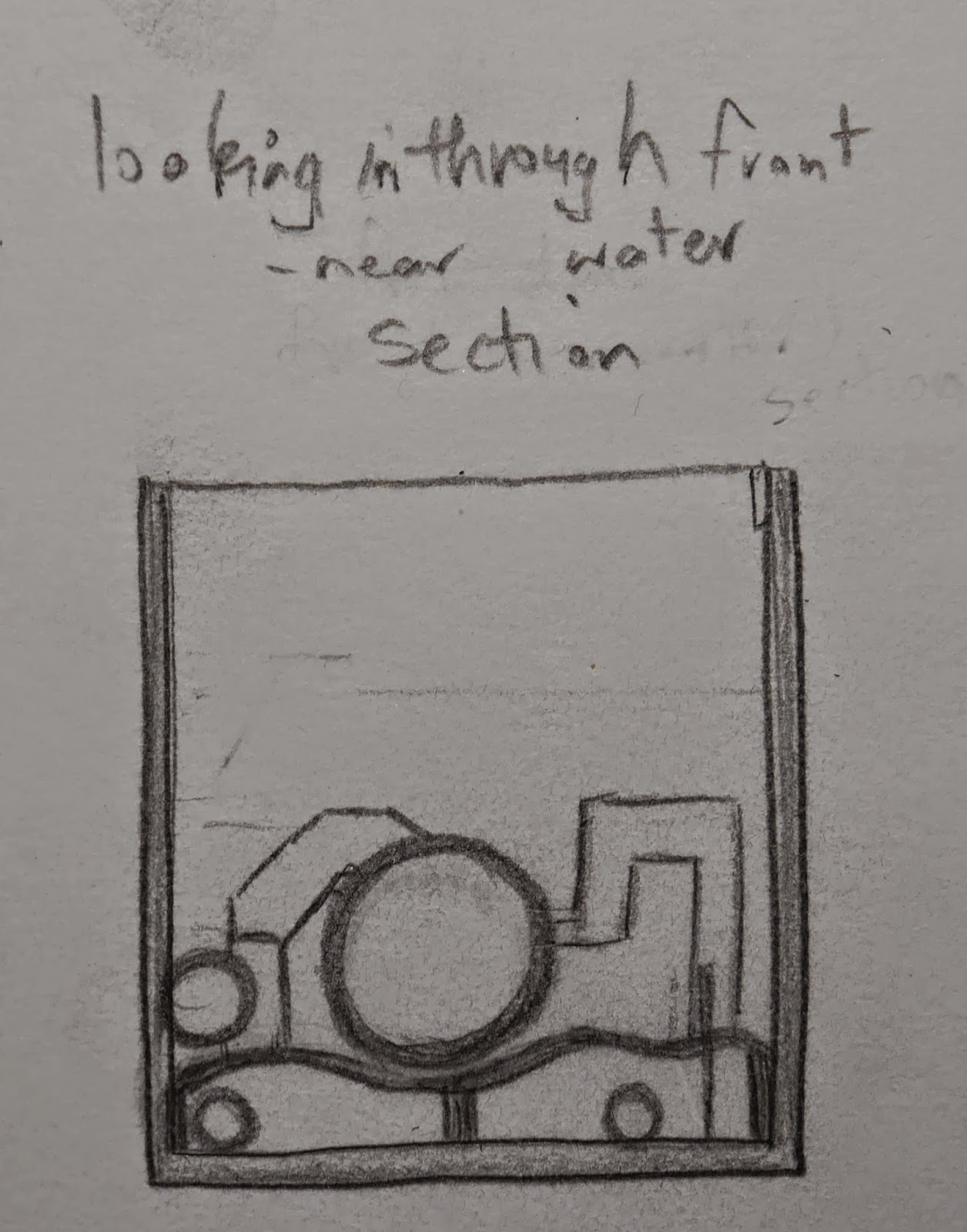
in progress section view
in progress perspective rendered
It is hard to show the kind of textures in the play area (mainly plastic) as they are shiny and I am unable to portray that texture through just coloured pencils
It is hard to show the kind of textures in the play area (mainly plastic) as they are shiny and I am unable to portray that texture through just coloured pencils
in progress perspective - rendered with coloured pencil
in progress plan view - colours link with the above perspective colour drawing
in progress elevation view of the right side of the boat shed
- the ladders clip over the walls and onto the interior wall, so if you wish to you can sit on the wall
(see image below)
in progress walk through movie
Screenshots of model in sketch up
- my meeting is between human and exploration/experimentation
- my meeting is between human and exploration/experimentation
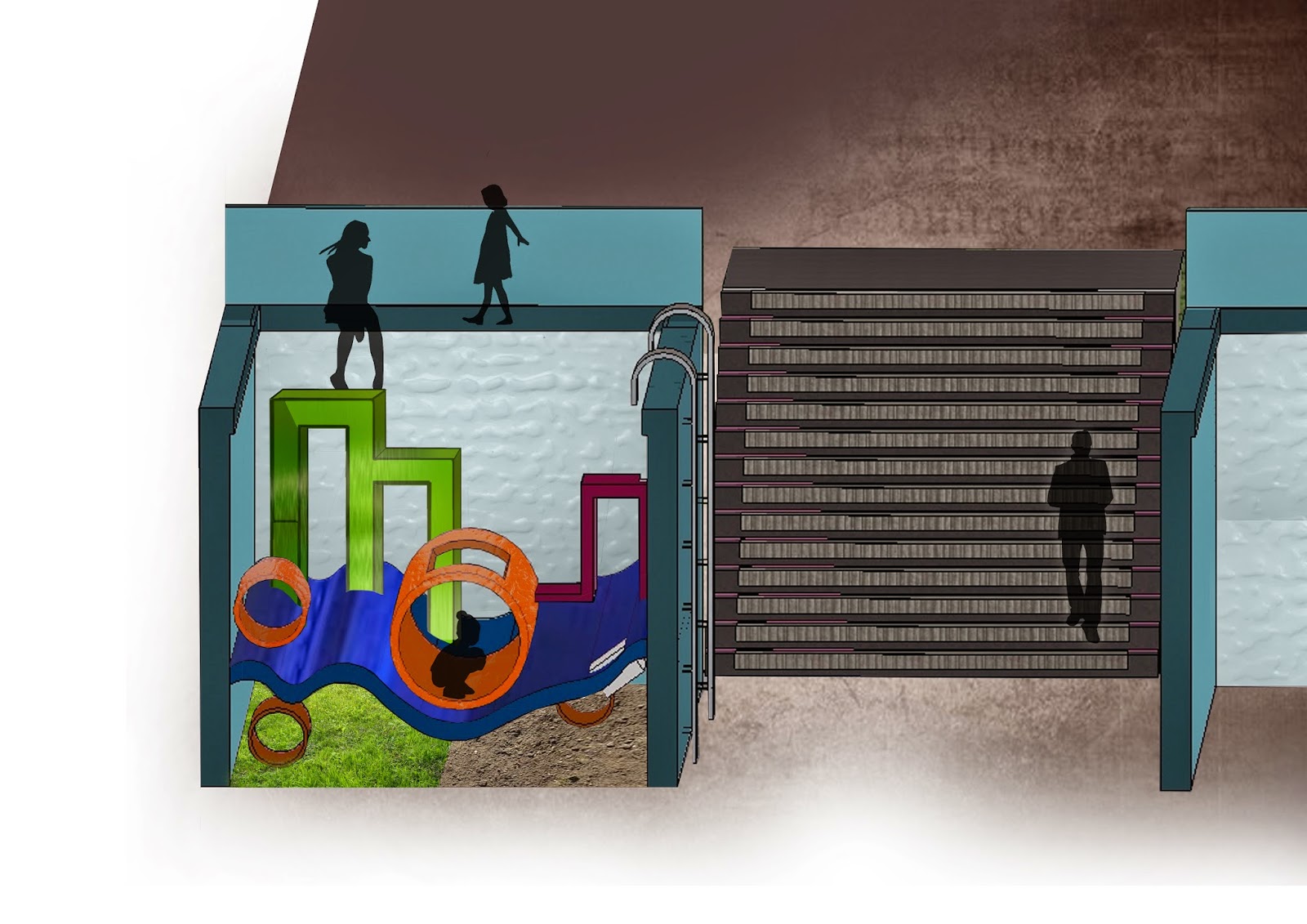
elevation view - I chose to use the wavy blue structure as a type of floor/surface as the boat sheds are near the water and the curves are characteristic of water/waves
section view

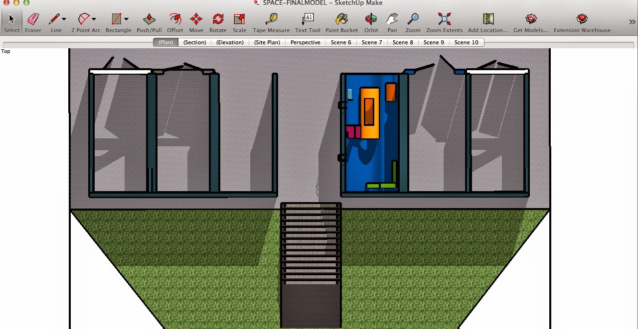
plan view
birds eye view
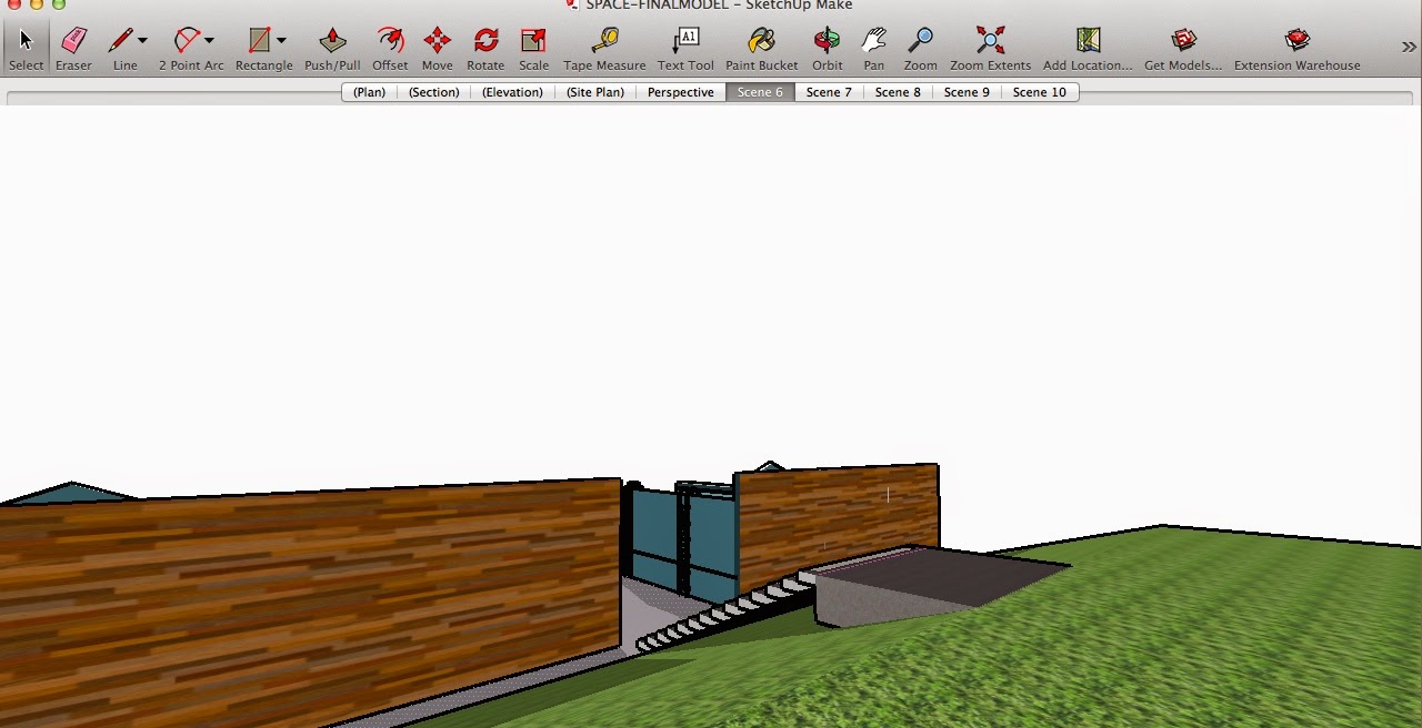
perspective views
Because I have added in ladders that clip/hang over the edge of the wall(above image), I needed to shift the stairs further back on the model. This change meant I could then have a hill/grass area behind the boat sheds in which people could have a break or lie down and relax while their kids run around on the play area (below image)

view from the back of the boat shed/play area looking out
(18/8_ Trying to import my boat shed model into cry engine but this came up when I tried to open my model. (I did all my sketch up models on my own laptop)
.........so I haven't officially had a proper walk around/experiencing the space
on cry engine with one of my own models but the next best thing is walking around
in my sketch up model, which is what my walk through movie is of.
My meeting is between
'body and experimentation/exploration'
and is in the context of being in a play area
Drawings
Other drawing - Before critique in class
FINAL other drawing - After critique in class
Plan view - Before critique in class
FINAL plan view - After critique in class
FINAL perspective view - After critique in class
Section view - Before critique session
With this drawing I wanted to show the space as if it were like a kids' drawing
- sketchy and block colours .....but it doesn't really fit in with my other final drawings as it has minimal texture and is very flat
FINAL section view - After critique session
Elevation view - Before critique in class
FINAL elevation view - After critique in class
My walk through movie


